Showing posts with label simple. Show all posts

Friday, 15 November 2013

Mist – functional multi-purpose landing page (Landing Pages)

Mist is a minimal multi-purpose landing page designed to help you showcase your product.


Features


  • Built with Bootstrap 3 and LESS

  • Fully responsive layout (optimized for phones, small tablets, tablets, medium and large computer screens)

  • Working contact form

  • Working AJAX subscription form with easy MailChimp and CampaignMonitor integration

  • Pricing tables

  • Popup galleries with inline content, image, video and iframe support

  • Testimonials slider

  • More than 1000 icons (Glyphicons, FontAwesome and Ionicons)

  • Smooth page scrolling

  • Minimal, clean design


Please note: images used in the preview are not available in the downloaded files, however they can be easily generated using services like PlaceIt and MockUPhone

Support


Support is provided via email: mailbox@happytodesign.com

Changelog


v1.3.1 – 14 november 2013
– Fix smoothScroll issue (now waits for images to load)

v1.3.0 – 14 november 2013
– Pricing tables

v1.2.1 – 12 november 2013
– Better documentation
– Minor bugfixes

v1.2.0 – 10 november 2013
– Contact form
– Ionicons icon font support

v1.1.0 – 7 november 2013
– Popup galleries
– Bootstrap updated to 3.0.2

v1.0.0 — 6 november 2013
– Initial release

Credits


  • Bootstrap 3 – sleek, intuitive, and powerful mobile first front-end framework for faster and easier web development.

  • FontAwesome – the iconic font designed for Bootstrap.

  • Ionicons – the premium icon font for Ionic Framework.

  • jQuery – fast, small, and feature-rich JavaScript library.

  • Magnific Popup – responsive jQuery lightbox plugin that is focused on performance and providing best experience for user with any device.

SquareMail Email Template (Newsletters)

SquareMail is a MailChimp ready, simple and elegant email newsletter template available in 12 colors with 12 layouts for each color.


There are a total of 144 HTML files in the package, with 12 MailChimp coded HTML files and 24 PSD files.


Features


  • 144 HTML files

  • Mailchimp ready (12 Mailchimp-ready templates, one for each color). Mailchimp integration tutorial included in the package.

  • 12 different colors : blue, brown, cyan, dark blue, gray, green, indigo, orange, pink, purple, red, yellow. For a preview of each color see the live demo. Also adding your own color is really easy.

  • 12 fully layered, fully editable PSD files of the full template

  • 12 layered PSD files for the headers used for each color.

  • 12 different layouts for each color

  • inline CSS

  • fully editable

  • easy add your business name and details

  • industry standard 600px width

  • cross-browser compatible

  • major mail clients compatible (Thunderbird, Apple Mail, Outlook, Lotus Notes, Yahoo Mail, Gmail, AOL)

  • mobile compatible

  • simple, elegant, flat style design

  • layers nicely organized in groups (PSD files)

  • ready to edit and customize

  • all you need to do is change the text and images

  • fonts used : Arial

  • perfect for any business

  • documentation included (you are reading it)

SimpleMail Email Newsletter Template (Newsletters)

SimpleMail is modern elegant email newsletter template available in a wide variety of pre-built layouts to satisfy your every need.


The package includes 8 different layouts in 10 colors. Each color has it’s own fully editable, fully layered PSD file. Each color has 8 different layouts making a total of 80 HTML files. Full details of this email newsletter template can be found below.


Features


  • 80 HTML files

  • 10 different colors : blue, brown, cyan, dark blue, gray, green, orange, purple, red, yellow. For a preview of each color see the live preview above. Also adding your own color is really easy.

  • 10 fully layered, fully editable PSD files of the full template

  • 10 layered PSD files for the headers used for each color.

  • 8 different layers for each color

  • inline CSS

  • fully editable

  • easy add your business name and details

  • industry standard 600px width

  • cross-browser compatible

  • major mail clients compatible (Thunderbird, Apple Mail, Outlook, Lotus Notes, Yahoo Mail, Gmail, AOL)

  • mobile compatible

  • simple, elegant, flat style design

  • layers nicely organized in groups (PSD files)

  • ready to edit and customize

  • all you need to do is change the text and images

  • fonts used : Arial

  • perfect for any business

Blogify Flat Responsive WordPress Blog Theme (Blog / Magazine)


About Blogify


Blogify is an awesome WordPress theme which brings clean & flat design. It’s ideal for personal blogging . It’s very flexible and powered with Bootstrap framework. Blogify has advanced theme options to make your site very flexible and fully customizable.


Features


  • NEW! Added: 2 different styles “Related Posts” section with enable/disable option.

  • NEW! Added: An option to show the right/left sidebar by default.

  • NEW! Added: Article links color option to ‘Theme Options Panel’.

  • NEW! Added: Sticky Sidebar.

  • NEW! Added: Link Post Type.

  • NEW! Added: Recent Comments Widget with avatar.

  • NEW! Added: Popular Post Widget.

  • NEW! Added: Social Widget

  • NEW! Added: Ads Widget

  • NEW! Added: Flickr Widget (slider style).

  • NEW! Added: Option select ‘Single Post Pagination’ position.

  • NEW! Added: Option to enable or disable ‘Post Format Icon’.

  • NEW! Infinite posts option when scroll down with backend options, users can switch between default pagination and infinite scroll.

  • NEW! Infinite posts page template. So users can use both pagination options (default pagination and infinite scroll).

  • NEW! Option to disable or enable Google fonts and use default browsers fonts instead.

  • NEW! Wordpress Gallery Style with Lightbox.

  • NEW! Option to enable or disable search form in header.

  • NEW! Soundcloud social icon.

  • Super clean & flat design.

  • Built on Bootstrap.

  • Fully responsive layout that works in all mobile & tablet devices.

  • Gallery Post Slider is using FlexSlider.

  • Ready For Translation (po/mo file included).

  • 500+ Google Fonts.

  • Demo Data included – one click install.

  • Custom logo & favicon upload option.

  • Custom styling options.

  • Supported Post Formats: Audio Post, Video Post, Gallery Post, Featured Image Post and Standard Post.

  • Advanced Admin Panel with Lots of Options: Styling Options, Custom Logo and Favicon Option, Control Blog Option, Slider Post Option and much more…

  • Cross browser support.

  • Rich Documentation.

  • Visual Shortcode Manager.

  • Advanced theme options panel.

  • WordPress 3.5 and 3.6 compatible.

  • Excellent Support.

  • And so much more…


Credits


  • All images from DeviantArt and are not included in the download file.


Changelog


+ Update - Version 1.5.1 (October 26, 2013)
- Fixed: Audio player visual bug in mobile devices.


+ Update - Version 1.5 (October 23, 2013)
- Added: 2 different styles "Related Posts" section with enable/disable option.


+ Update - Version 1.4 (October 21, 2013)
- Fixed: Third level menu bug.
- Fixed: Responsive sidebar bug.
- Added: Close button to sidebar.


+ Update - Version 1.3 (October 8, 2013)
- Added: An option to show the right/left sidebar by default.
- Added: Article links color option to 'Theme Options Panel'.
- Some CSS and Javascript updates in 'Theme Options Panel'.


+ Update - Version 1.2 (October 1, 2013)
- Added: Sticky Sidebar.
- Added: Link Post Type.
- Added: Recent Comments Widget with avatar.
- Added: Popular Post Widget.
- Added: Social Widget
- Added: Ads Widget
- Added: Flickr Widget (slider style).
- Added: Option select 'Single Post Pagination' position.
- Added: Option to enable or disable 'Post Format Icon'.
- Fixed: Google Analytics Code issue.
- Fixed: Gallery Post images issue.
- Fixed: Post images are centered if users want to use smaller images.
- Fixed: 'Infinite Posts' issue (not duplicate posts anymore).
- Localization files updated.
- Documentations updated.


+ Update - Version 1.1 (22.09.2013)
- Added: Infinite posts option when scroll down with backend options, users can
switch between default pagination and infinite scroll.
- Added: Infinite posts page template, so users can use both pagination options
(default pagination and infinite scroll).
- Added: Option to disable or enable Google fonts and use default browsers fonts
instead.
- Added: Wordpress Gallery Style with Lightbox.
- Added: Option to enable or disable search form in header.
- Added: Soundcloud social icon.
- Fixed: Now in single post the quote and quote author will be printed before the
post content.
- Fixed: Contact form e-mail field.


+ Update - Version 1.0.5 (19.09.2013)
- Fixed: Custom Logo Url
- Fixed: Archive Latest Posts Order


+ Initial Release (17.09.2013)


Flag Counter

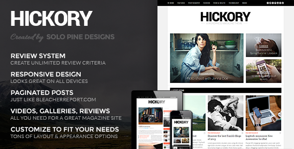
Hickory - A WordPress Magazine Theme (Blog / Magazine)

Solo Pine Designs


Follow on TwitterFollow on FacebookFollow on Envato


Update: Version 2.0.3 is out now!


Design trends are constantly changing and it’s critical to adapt at the drop of a hat; stay ahead of the game with Hickory, an incredibly customizable magazine & blog theme designed to meet your every need. Hickory’s clean and highly adaptable form was specifically crafted to appeal to every niche and comes chock-full of premium features. Whatever your magazine or blog needs, Hickory is here to deliver!


Hickory Features


Version 2.0.3


  • Added: Option to enter a custom link on the headlines in homepage widgets

  • Fixed: An issue with Vimeo videos not embedding correctly

  • Fixed: Footer borders in responsive

  • Fixed: Images with captions will now scale down correctly in responsive

  • Fixed: Gallery Captions in full width layout will now display

  • Fixed: Google Plus badge in the social widget

  • Fixed: Removed empty links on headlines in homepage widgets

  • Files changed:

  • - style.css

  • - single.php

  • - /inc/featured_area/featured.php

  • - /inc/featured_area/featured-2.php

  • - /inc/widgets/homepage_widget.php

  • - /inc/widgets/homepage_slider_widget.php

  • - /inc/widgets/homepage_3col_widget.php

  • - /inc/widgets/social_widget.php

  • - /inc/templates/single_full_image.php

  • - /css/responsive.css


Version 2.0.2


  • Fixed: An issue where an error message was appearing on the homepage if you were using the grid layout

  • Fixed: Borders in the footer will now appear again

  • Files changed:

  • - index.php

  • - /inc/customization.php

  • Added: footer-lines-dark.png to img folder


Version 2.0.1


  • Fixed: An issue where the exclude featured posts from homepage widgets didn’t work

  • Fixed: If sticky navigation was activated and you pressed the search button the page would scroll to the top.

  • Files changed:

  • - functions.php

  • - /inc/widgets/homepage_widget.php

  • - /inc/widgets/homepage_slider_widget.php

  • - /inc/widgets/homepage_3col_widget.php

  • - /js/hickory.js


Version 2.0


  • Added: New type of post: Music Post. Embed music from Soundclod, Spotify or Youtube/Vimeo. (Example)

  • Added: Full Width Post Template (Example)

  • Added: Option to have search bar in header

  • Added: Option to exclude featured posts from homepage widgets/post loop

  • Added: Option to select multiple categories in homepage widgets

  • Added: More Social icons (Linkedin, Soundcloud & Dribbble)

  • Added: Option to change colors/hover colors of social icons. Font-Awesome is now being used.

  • Added: Option to change Footer Appearance

  • Added: Custom CSS in Theme Options

  • Added: Featured area now have hover effect

  • Added: Option to pick how many posts you want to show in the 3Col Homepage widget (in the more posts area.)

  • Added: Option to set background position (left, right, center)


  • Bug Fixes

  • Fixed: Issue where inserting an apostrophe in the Review summary text would insert a ”/” as well

  • Fixed: Logo in Mobile view now displays correctly size

  • Fixed: You can now use the tags strong and italic on the same word.

  • Fixed: Thumbnail icons (video, gallery & music icons) is now clickable

  • Fixed: Author pages where the author name was made of two words is now showing correctly

  • Plus a few other minor fixes!


Version 1.1.3


  • Added: Improved Responsive Menu

  • Added: Option to enter captions for gallery images

  • Fixed: Font in Homepage slider widget will now change if a custom font is chosen

  • Fixed: Background fixed option now works properly

  • Fixed: Videos in post content is now responsive

  • Fixed: Moved blog name after page title in the < title > tag

  • Fixed: Galleries now looks fine on tablets

  • Fixed: Navigation text will stay centered if custom font have been chosen


Version 1.1.2


  • Added: Option for sticky navigation bar

  • Added: New homepage ad widget

  • Fixed: Issue with header banner not displaying google adsense

  • Fixed: Issue with header layout 3 in responsive


Version 1.1.1


  • Fixed: an issue with the social widget not displaying facebook profile.
    File updated: inc/widgets/social_widget.php


Version 1.1


  • Improved Paginated Posts: Hickory now comes with the premium plugin (worth 15$) Theia Post Slider. See it in action

  • Added new header layout

  • Added option for leaderboard banner in header

  • Added new widget: Highest Rated Review.

  • Fixed a few bugs


Theme Features


  • Fully Responsive

  • Works with WP 3.6

  • Build your homepage or any page with the 3 custom homepage widgets (each has tons of options)

  • Choose a Slider or 3 Static Posts for you featured area

  • Built-in Review System with unlimited review criteria

  • Video Posts – self-hosted or embedded

  • Gallery Posts – normal or full-width

  • Schema SEO Rich Snippet Review Microdata

  • Support for Google Headshot in Google search results Read More

  • Paginated Posts – just like on Bleacherreport.com – See Example

  • Loads of custom widgets

  • Theme Options Panel – Powered by Vafpress Framework

  • Unlimited Skins – Find tons of appearance and font options in Hickory Theme Options

  • WordPress 3.0 drop-down support

  • Translation Ready


Thanks for checking out Hickory!


Feel free to contact us with any questions or comments you may have— you’re the reason we’re here! We love any and all constructive feedback and even folks dropping in just to say hello.


And, if you love Hickory as much as we know you will, please remember to rate it.


Want to stay in touch?


Redox WordPress Theme (Blog / Magazine)

Features

  • Fully Responsive
  • Post Sharing
  • Embeddable Media – Easily post videos vimeo, youtube, soundcloud embeds by simply entering the page url.
  • Shortcodes – Redox comes stocked with a shortcode generator that can easily be accessed in a few clicks from the post editor.
  • Twitter Feed
  • Social Network Widget – Over 30 social network widgets to use.
  • Multiple Post Type Support
    • Standard
    • Photo
    • Chat
    • Video
    • Gallery
    • Aside
    • Link
    • Quote
  • Off Canvas Sidebar
  • Multiple Post Sizes
  • Admin Panel to fully customize Redox to your liking.
  • Group Blogging – Redox displays an author portrait for each post in the meta section. Great for teams/companies that have multiple submitters.
  • Infinite Scroll – Trigger Pagination
  • Header Image support
  • Background Image support


Changelog


Version 1.0.0 - Initial Release
Version 1.0.1 - Minor Bug Fixes

Demo images provided by Brian Van Wyk

Spina 2 - Responsive Admin Template (Admin Templates)

Dear purchasers: Let us know what you’d like to see added to this template.
As web app developers we are really glad with Spina. We’ve been using it for over a year now with excellent results. For us, this template has the exact amount of features we need. We are open to suggestions from other developers and would very much like to hear what others would like to see in a template like this. We strive to build the most simple and intuitive admin template available.


Introduction


After more than a year of design, development, testing and real-world use denkGroot releases the follow-up to last year’s Spina Admin Template.

This year we doubled down on simplicity. We put a lot of effort in building a responsive admin template we would want to use for our own projects.


It’s built entirely using the latest techniques and HAML, SASS and CoffeeScript.


Updates


Update 1.0.1


  • Loading SVG-font above WOFF-font for smooth font rendering in Chrome


Roadmap


Help us define the roadmap to further enhance this template. Please leave a comment or send us an email with your ideas. :-)

Specifications


We highly recommend checking out the Live Preview but here’s a summary of what you’ll find there:


  • HTML5/CSS3 output

  • Built with HAML/SASS/CoffeeScript

  • Responsive!

  • Retina!

  • Beautiful icon font support

  • Custom notifications

  • Nested sortable lists

  • Markdown editor

  • Wysiwyg HTLM5 editor

  • Super simple forms

  • Custom animated checkboxes

  • Custom file field

  • Custom slider

  • Custom stylized datepicker

  • Custom colorpicker

  • CSS3 animated buttons

  • Beautifully CSS3 animated modals

  • Custom select boxes

  • Button badges

  • Awesome animated image gallery

  • Custom image selectors (multiple+single selects)

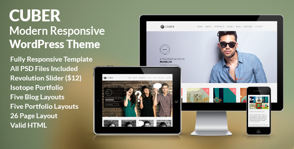
Cuber - Modern Responsive Minimal WordPress Theme (Creative)


Description


Cuber is the ultimate and professional way for you to present your portfolio or the very best starting point for your own corporate website. If you are searching something different and out of the line, please check out the Cuber – Modern Responsive Minimal WordPress Theme!

Cuber is fully responsive – resize your browser window to see it in action. All the layouts are built with responsive design in mind. It works well on desktops, tablets, and mobile devices. The template is perfectly adapted to various screen sizes, and its attractive fresh design makes it look great.

Cuber is a fully configurable and easy to use WordPress theme with a lot of great features. It has been specifically designed to be easily customized and it’s created by using the latest HTML5 and CSS3 techniques. With a responsive design it is easily usable with any device!

If you are searching something different and out of the line, please check out the Cuber – Modern Responsive Minimal WordPress Theme


Features


  • Fully Responsive WordPress Theme,

  • Valid HTML5/CSS3,

  • Revolution Slider Included ($12),

  • Responsive Homepage Slider,

  • Advanced CSS3 Animations,

  • Three Homepage Layouts,

  • Five Blog Page Layouts,

  • Five Portfolio Page Layouts,

  • About Us Page,

  • Team page,

  • FAQ page,

  • Services Page,

  • Two Contact Page Layouts,

  • Page Elements,

  • Accordions & lists,

  • Buttons,

  • Pricing Tables,

  • Filterable Portfolio,

  • Masonry Portfolio,

  • Filterable Blog,

  • Masonry Blog,

  • Well organized and commented code,


Credits


Images used in the demo are not distributed with the theme.

JavaScript


  • Modernizer – the feature detection library for HTML5/CSS3

  • Class: prettyPhoto – Lightbox clone for jQuery

  • jQuery Plugin for kenburn Slider

  • jQuery v1.7.1 jquery.com

  • Foundation Responsive Library

  • jQuery Easing v1.3

  • Isotope v1.5.25

  • jquery.dlmenu.js v1.0.1

  • BxSlider v4.1.1 – Fully loaded, responsive content slider

  • Lazy Load – jQuery plugin for lazy loading images

  • FitVids 1.0
  • Webmakers - one page WordPress Theme (Creative)

    Webmakers – One page WordPress Theme


    Webmakers is a single page WordPress Theme recommended for creatives, freelancers and agencies.
    This theme coming with 5 pre-made theme skins, powerful theme options with ability to change typography (choose from standard and 600+ Google webfont with live preview! ), Unlimited colors with colorpicker for theme skin and body background, great custom plugin based shortcode generator to build theme element easily and much more!


    one page wordpress theme


    Theme features:


    Create home sections as much as you want


    Responsive with twitter bootstrap


    5 premade skins


    Easy to Use & Powerful Theme Options


    • Each field has clear description to help you set the theme

    • Import & Backup options


    Typography settings (Super Easy via theme options)

    • Change font family, size, color and line height

    • Can choose from Standard font or from 600+ Google web font (font preview available)


    Styling settings (Super Easy via theme options)

    • Switch skin from 5 pre-made skins easily

    • Customize element colors (unlimited color) via color picker!

    • upload your own image and set it as body background!


    8 Shortcodes, insert easily by click shortcode button

    • Row, Columns, Progress bar, Buttons, divider, call action, Box content, Team


    Built in ajax contact form


    Parallax on section background


    XML Sample data + Theme options setting included


    Fully layered PSD source included!


    Translation ready .mo .pot .po included


    Documentation


    Updates


    Oct 30, 2013
    - Fix backend UI (publish box on post editor) issue on WP 3.7.1
    - Fix mail section on section-contact.php


    Credits:

    HUNTER - a retina-ready HTML5+CSS3 mobile template (Mobile)


    The flattest mobile template on ThemeForest


    Hi there and thanks for taking a look at this template!


    ‘Hunter’ is a flat and classy template that makes setting up your site an utter breeze. Unlike some other templates, ‘Hunter’ allows for super fast editing of your site thanks to the use of includes. For example, need to add an item to the menu? No need to go through the dull task of making the change on every single page on your site; simply edit a dedicated menu file to apply the change. You’ll be making site-wide changes in seconds. Literally.


    ‘Hunter’ is also a carefully coded template (HTML5 and CSS3 validated) with different sections of each page clearly commented. That alone will massively reduce the time it takes for you set up the site and make changes afterwards.


    Once you make the purchase, you’ll immediately have access to both this demo site’s files as well as a secondary set of pages which display blocks of code below each content element; to set up your site, you can just copy-paste blocks of code where you want, all without having to dig around in the code to figure out how the template is built.


    ‘Hunter’ is also thoroughly tested and is well acquainted with iOS, Android and Windows devices, plus even desktop browsers (Chrome, Firefox, Safari, Internet Explorer, Opera).


    And finally, as folks who’ve purchased our previous templates and themes can attest to, we take good care of our customers. In fact, we’ll take a step back and let them do the talking here:


    • “I’ve never had a customer service experience as great as I had with Bonfire Themes…”

    • “You guys have the best customer service on Themeforest! A+++”

    • “This is by far the best support I’ve gotten on TF.”

    • “Best support I’ve ever seen! .. Five stars is not enough!”

    • “… customer service provided goes above and beyond … An excellent experience from start to finish.”

    • “Thanks a lot for your help – very quick!”

    • “… extreme fast response!!!”

    • “Wow, thanks for the prompt response.”

    • “Excellent response time, man. Awesome service.”

    • “Thank you very much for the super-quick support.”

    • “Thanks for such a speedy response! You rock man!”


    If you have any pre-sale questions, you can contact us directly through our ThemeForest profile or by submitting your query on this template’s comments section on ThemeForest.


    And finally-finally, a big thanks for reading through this wall of text! :)


    Update 1.1


    - Addressed potential iOS 7 icon display issue

    More from Bonfire


    Consider having a look at our full ThemeForest portfolio.

    We also create WordPress plugins; visit our CodeCanyon portfolio.

    SIMPLE - Easy Parallax Retina WordPress Theme (Creative)

    Please note: If you are checking the live preview from a Mobile, please close the top frame (theme selection bar) to see the perfectly responsive layout


    Simple, as the name says, is a very easy to use creative WordPress theme with both single page and multiple page layout. Theme features parallax, animated contents and Retina Display optimization on a perfectly responsive layout.


    Layout is built with Bootstrap, fully responsive and optimized for all devices. We have fully tested it on iPhone 5, iPad 4, S3 android and Windows Phone.


    Testimonials from buyers of HTML5 version


    Best features:


    • Very simple & easy to use creative one page theme.

    • Trendy flat style design with selected metro colors.

    • Responsive & Retina Ready layout.

    • Stellar parallax layers with optimized mobile view.

    • Animated Elements & Content Blocks, supports more than 50 animation effects. See animation effects preview here

    • Touch optimized & draggable Carousel.

    • Filterable Portfolio with Expanding preview as well as Lightbox view.

    • Expanding portfolio preview panel supports image sliders, video, youtube, vimeo etc.

    • Portfolio lightbox supports images, video from youtube and vimeo.

    • Flickr Integrated dynamic image grid featuring live Flickr Feed.

    • Twitter Integrated with latest API compatibility.

    • Perfectly responsive, mobile optimized layout powered by Bootstrap 2.3.2

    • Fully tested on major mobile devices including iPhone 4S & 5, iPad 3, iPad 4 with Retina Display, Galaxy S3 on Android, Windows Phone.


    Dedicated Support:


    Dear buyers, for free support on our themes please contact our developers via our Support System website: http://support.designova.net/
    You can surely expect response within 24 hours.


    Image Credits:


    Live preview images are from Flickr profile of Fotuwe, CubaGallery as well as Vonderauvisuals.
    We are not distributing these images via download pack. We have placeholder images for each instance.

    Theme Credits:


    Concept & Design by Jean P. Johnson and Coded by Ancil K Anto with Team Designova.
    A premium quality template from Designova.
    Made with love in Kerala, The God’s Own Country.

    Flat: Responsive and Multipurpose Creative Theme (Creative)

    Flat is a responsive and multipurpose theme for creatives.
    Perfect for freelancers, designers, illustrators, creatives and agencies alike.
    The originality of the theme, is stunning design and layout capabilities will give your portfolio pieces the attention they deserve.
    Flat is a high customizable theme with a full responsive layout. Trough a dedicated control panel is possible to configure the majority theme’s aspects and to choose the favourite colour among ten of them.
    Flat take advantage of all WordPress features such as post-formats, page templates, custom widgets, shortcodes, including important features specifically designed for it.


    A few of the options and coolest features of the home page
    Trough appropriate options, the administrator can fully configure posts and grid’s layout and many other features. Check them out in the demo!


    Responsive design
    Serve an optimised version of the volumes theme to your visitors using tablet and mobile devices. Optimised for iPad and iPhone.


    Main features


    • WordPress 3.5+ support

    • Valid HTML 5

    • Cross-browser compatibility

    • Responsive design

    • Retina ready

    • Apple touch icon

    • Translation ready

    • Extensive documentation support

    • XML demo data available


    Theme options


    • Powerful and easy to use Theme options panel

    • Custom logo upload

    • Custom favicon upload

    • Custom touch icon upload

    • Contact form submission

    • Google analytics ready

    • Google Maps ready

    • 10 different color scheme

    • Google fonts

    • Social media icons

    • Custom widgets


    10 page templates (with related options)


    • Default template

    • Alternative blog

    • Archives

    • Contact

    • Contact alternative

    • Homepage

    • Homepage alternative

    • Portfolio

    • Sidebar

    • Team


    Custom post type


    • Portfolio

    • Team members


    5 Post formats (with related options)


    • Standard

    • Gallery

    • Video

    • Quote

    • Link


    Shortcodes


    • Intuitive and graceful shortcode generator


    Other good stuff


    • Powerful & Lightweight

    • Fully Responsive Build

    • Dribbble, Twitter and Flickr widgets

    • SEO optimized

    • And much more! Check out the live preview!

    TOUCH: a retina-ready HTML5 + CSS3 mobile template (Mobile)


    Hi there and thanks for taking a look at this template!


    ‘Touch’ is a light and airy template that makes setting up your site an utter breeze. Unlike some other templates, ‘Touch’ allows for super fast editing of your site thanks to the use of includes. For example, need to add an item to the menu? No need to go through the dull task of making the change on every single page on your site; simply edit a dedicated menu file to apply the change. You’ll be making site-wide changes in seconds. Literally.


    ‘Touch’ is also a carefully coded template (HTML5 and CSS3 validated) with different sections of each page clearly commented. That alone will massively reduce the time it takes for you set up the site and make changes afterwards.


    Once you make the purchase, you’ll immediately have access to both this demo site’s files as well as a secondary set of pages which display blocks of code below each content element; to set up your site, you can just copy-paste blocks of code where you want, all without having to dig around in the code to figure out how the template is built.


    Additionally, there’s documentation that includes straightforward instructions on how to quickly change the phone number and email address for header bar, set up the menu, and so on.


    ‘Touch’ is also thoroughly tested and is well acquainted with iOS, Android and Windows devices, plus even desktop browsers (Chrome, Firefox, Safari, Internet Explorer, Opera).


    And finally, should you need a quick question answered, we’ll be here for you. As with people who’ve purchased our previous themes can attest to, our support is to die for. Here’s what some of our clients have to say about Bonfire Themes:


    • “This is by far the best support I’ve gotten on TF.”

    • “Excellent theme, fantastic support … You have solved my mobile headache.”

    • “Best support I’ve ever seen! .. Five stars is not enough!”

    • “Thank you for your swift reply!”

    • “I am impressed by the speed of your answer :)”

    • ”... customer service provided goes above and beyond … An excellent experience from start to finish.”

    • “Thanks a lot for your help – very quick!”

    • ”... extreme fast response!!!”

    • “Wow, thanks for the prompt response.”

    • “Excellent response time, man. Awesome service.”

    • ”... quick to respond and very helpful.”

    • ”... documentation [has] been a great help…”

    • “Thank you very much for the super-quick support.”

    • “Thanks for such a speedy response! You rock man!”


    If you have any pre-sale questions, you can contact us directly through our ThemeForest profile, by emailing bonfirethemes[at]gmail.com or submitting your query on this template’s comments section here on ThemeForest.


    And finally-finally, a big thanks for reading through this wall of text! :)


    Update 1.3


    - Addressed potential iOS 7 icon display issue

    Update 1.2


    - Template files now come in two versions: PHP and HTML.

    Update 1.1


    - Updated main menu; an opened menu with sub items is now closed as another is opened.

    More from Bonfire


    Consider having a look at our full ThemeForest portfolio.

    We also create WordPress plugins; visit our CodeCanyon portfolio.